Context
I recently got involved in implementing an express payment/checkout feature on a top cosmetic e-commerce website. As a product person, we received a small deck of summarized interviews conducted to gain insights into what typical users would prioritize if they used “Express Payment/Checkout” during online shopping. Some findings like below:- Express checkout are being and should be perceived an easier and more convenient way of placing an order
- Certain payment methods are preferred.
- Users would like to see important info (Shipping, Tax, Promo) prior to considering payment.
- Security and Speed
A Mental Model
As a recent member of this organization, I’ve come across a situation where I believe the team could benefit from a mental model to better understand the problem we’re facing and the potential solutions. In essence, I’m proposing to develop a mental model that educates my team about how customers think and the resulting behaviors.Note: this Mental Model is for product team! Later in this blog, an Intent Model will be mentioned to depict customer’s behavior served as an Mental Model for the product team to understand user’s behaviors.
A naive Intent Model for the checkout process in online shopping.
A Typical Online Purchase process will look like this in a generic way: 🖱️→ 💄, 🧴→ 🛒 → 💳 → 📦A customer landing on website starts “Click🖱️, Adding Items💄,🧴into 🛒, Checking out 💳 and Placing an Order📦▪︎{🖱️→ 💄, 🧴→ 🛒} is usually called “Discovery Stage”, Industry jargon usually goes by “Top or Upper Funnel”, which shows users Intent to Buy ▪︎{🛒 → 💳 → 📦} is usually called “Decision Stage”, i.e. customers have made decisions on what to buy and ready to pay!!, similarly , industry jargon usually goes by “Bottom or Lower Funnel”, which shows users Intent to Pay
Just because customers add items to their shopping cart doesn’t necessarily mean they are prepared to make a payment. They bear two different mindsets showing two different intent. A well-designed checkout experience will effectively channel traffic from these two types of intents.This intent model is a simple analysis framework I have educated my team and aligned on building products. Every time, when we are trying to incorporate a new features requested by brands parter, we always think which intent this feature will serve, will this feature promote the traffic conversion between intents.
In Searching of A Mental Model of Express Checkout
Okay, now, I need search another mental model that could help depict Users Behavior when they interacting with express payments for my team. And I was thinking about this while I was driving on the road. 🚙🛣️Express Lane, Toll Station Design
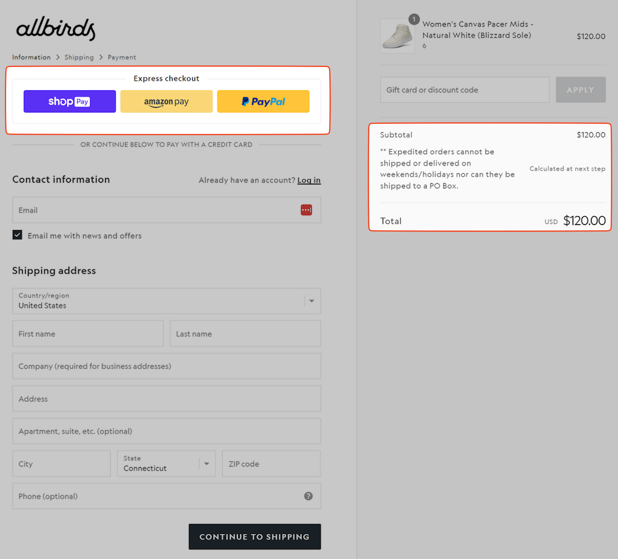
Yeah, I realize, building an express checkout solutions is like how to design an express lane before a toll station, right? The toll booth is like where the “payment collected” in a regular way. ▪︎Express Lane is like Express payments like: Apple Pay, Google Pay, PayPal, One-Click Payment which allows users to save time on repetitively input contact, billing, shipping address and payment information, the more time and efforts/steps between users’ click on checkout button and users click on placing order button will potentially lead “Drop-off👎”.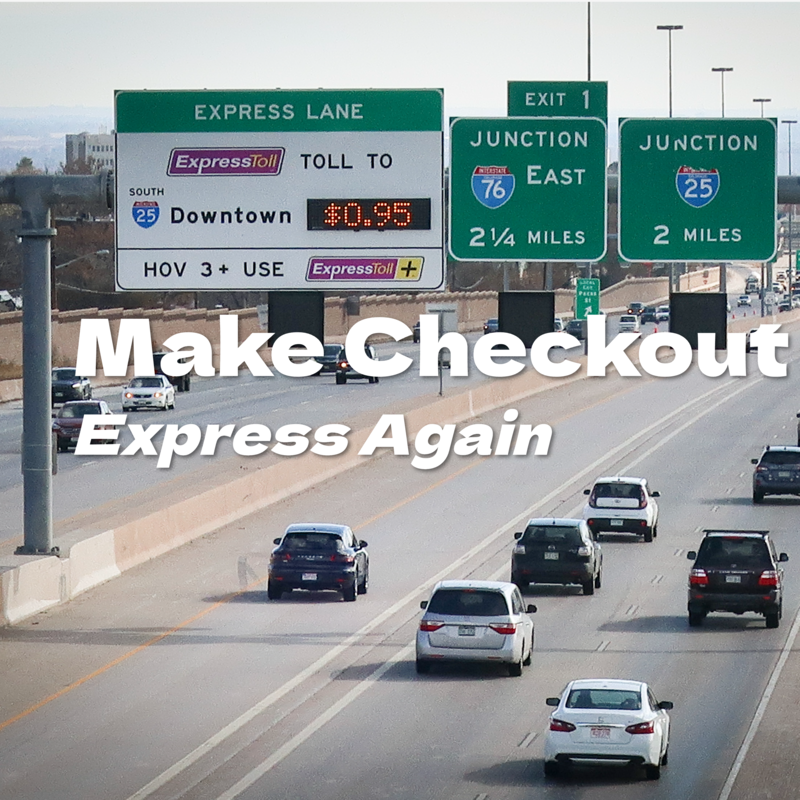 
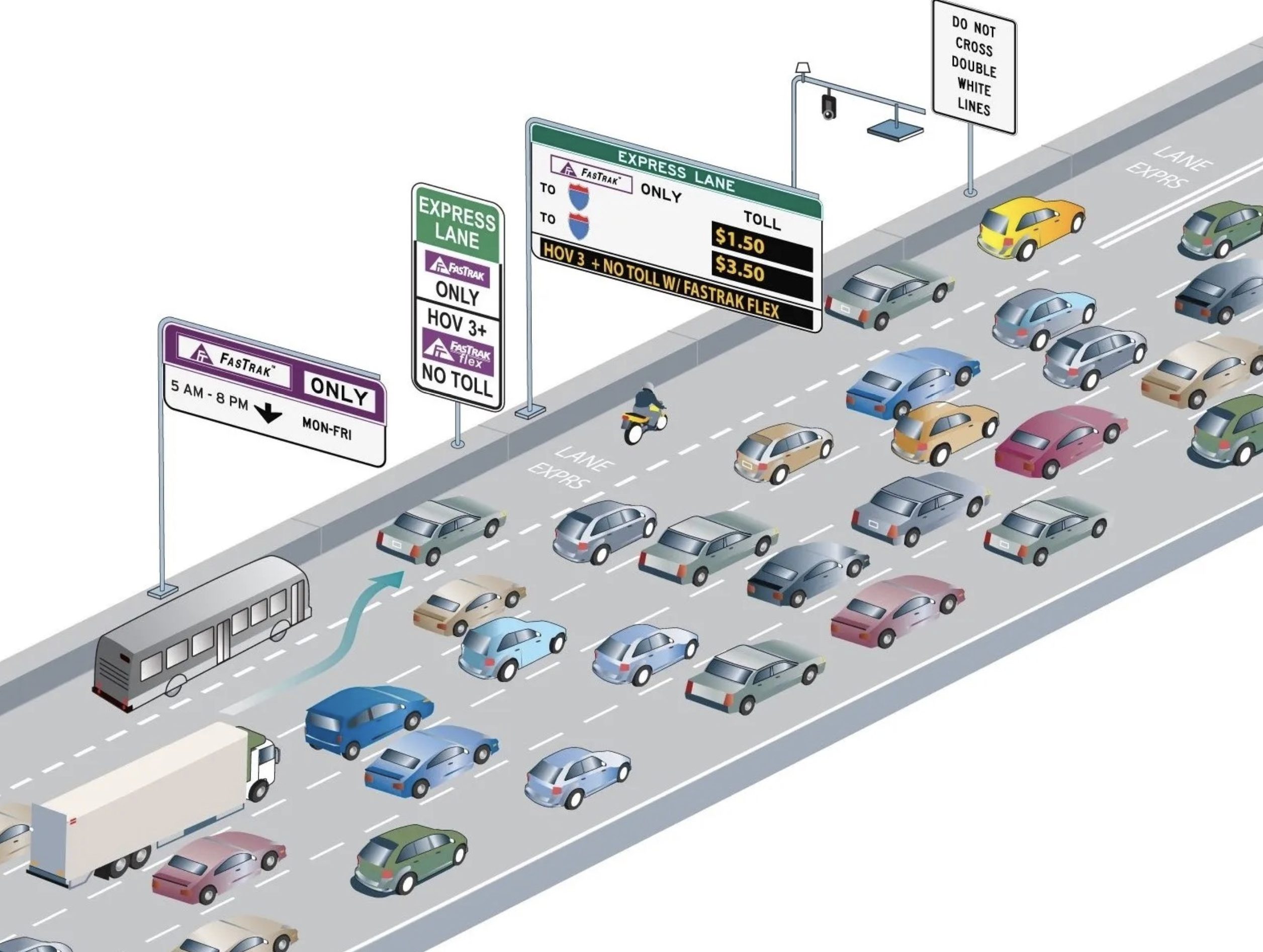
▪︎The reason we can legally drive through Express Lane to skip the toll booth is because the EZ tag, which is similar to the EZ Pass or Fastag or a Toll Tag if you live in California, requires the highway authority to store our payment details, vehicle information, and mailing address information, just like other payment methods like Apple Pay, Google Pay, and PayPal.
After conducting some research, booking a reading, and digesting the paper, I’ve compiled the following comparisons.

▪︎The reason we can legally drive through Express Lane to skip the toll booth is because the EZ tag, which is similar to the EZ Pass or Fastag or a Toll Tag if you live in California, requires the highway authority to store our payment details, vehicle information, and mailing address information, just like other payment methods like Apple Pay, Google Pay, and PayPal.
After conducting some research, booking a reading, and digesting the paper, I’ve compiled the following comparisons.Express Lanes(🚙⚡️🛣️) vs Express Checkout(🛒⚡️📦)
These are some aspects worth considering in during the product design.Decision Factors
▪︎Express Lanes(🚙⚡️🛣️): Need for speed, convenience, and avoiding manual toll booths ▪︎Express Checkout(🛒⚡️📦): Need for quick checkout, convenience, and avoiding manual data entryBesides collecting payments, we both are trying to improving the “traffic throughput” here, either for economic reason or revenue goal.
Information Neededℹ️
▪︎Express Lanes(🚙⚡️🛣️): Lane signage, EZTag account status, pricing of tolls, traffic flow ▪︎Express Checkout(🛒⚡️📦): Payment method availability, price, amount, supported platformsHere, e-commerce shopping behavior is slightly complicated because the “price and total amount” will be calculated on the fly based on the items in the cart, whether users applied promo code, tax calculation etc. We do have customer respond that they gave up using express payment is because they are price sensitive that they don’t know if promo code has been applied or not. Some worst cases are cancellations and requesting for refund, which actually defeat the purpose of express checkout
 Process Efficienc
y ▪︎Express Lanes(🚙⚡️🛣️): Seamless entry through toll booths without stopping ▪︎Express Checkout(🛒⚡️📦): One-click or minimal-step checkout without re-entering details Optimal UI/UX design, means users won’t miss the opportunity to use Express payment. I’ve had some experiences where the heavy traffic and the challenging ramp requiring multiple lane switches made me miss the express lane entry
 Barriers to Adopti
on ▪︎Express Lanes(🚙⚡️🛣️): EZTag account setup, initial fee, concerns over privacy or errors ▪︎Express Checkout(🛒⚡️📦): Security concerns, trust in data storage, account setup requirements Impact on User Beha
vior ▪︎Express Lanes(🚙⚡️🛣️): More predictable travel time, willingness to pay for convenience ▪︎Express Checkout(🛒⚡️📦): Reduced cart abandonment, increased conversion rates in e-commerce Cognitive
Load ▪︎Express Lanes(🚙⚡️🛣️): driver just drives through ▪︎Express Checkout(🛒⚡️📦): fewer steps and decisions required I’m also put a side by side table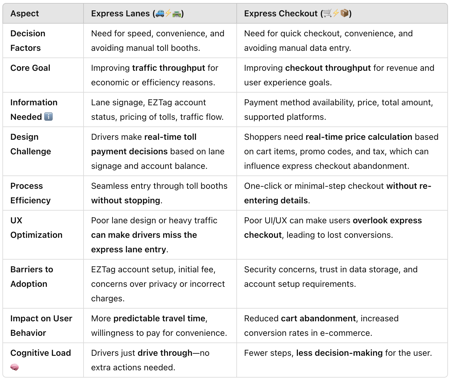 he
here:  User Behavior Mental Model: Borrowing Express Lane Design Wisdom for Better Express Ch
eckout So, using the comparison above, I was able to create a mental model for my team to comprehend and predict potential user behavior when interacting with an express payment system. The dimensions mentioned above were also utilized for design review and for measuring metrics in the actual implementation. A well-designed express lane operates on a few core behavioral principles that can directly inform how we optimize express checkout. By understanding how drivers make decisions in high-speed environments, we can craft a frictionless checkout experience that feels just as natural and efficient. ▪︎Early, Clear information: Pricing, Tax, Promo code ▪︎Show Accepted payment methods early ▪︎Progress indicators eliminated uncert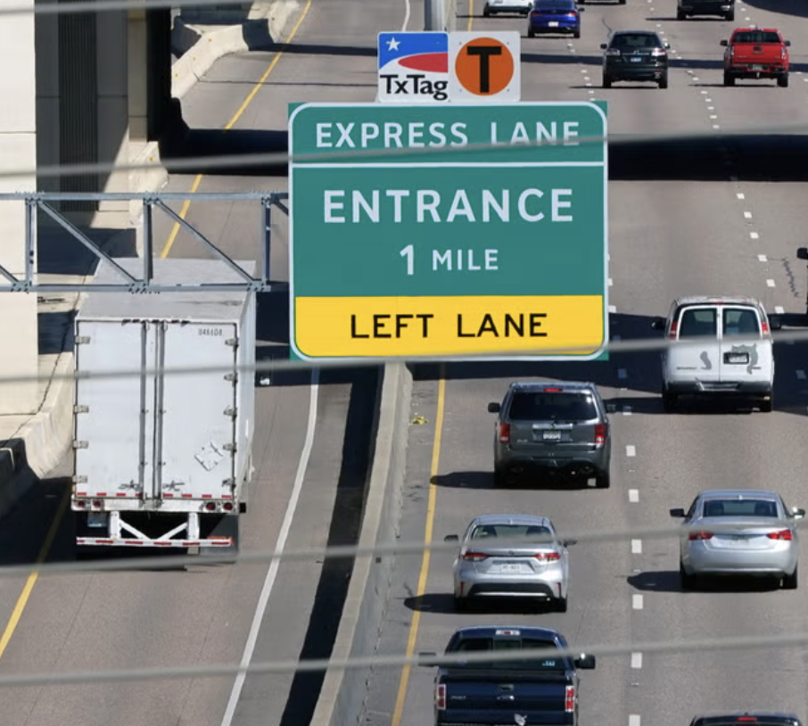 inty

An example of Etsy’s express payment option on Cart page, really demonstrates all the thoughts
inty

An example of Etsy’s express payment option on Cart page, really demonstrates all the thoughts 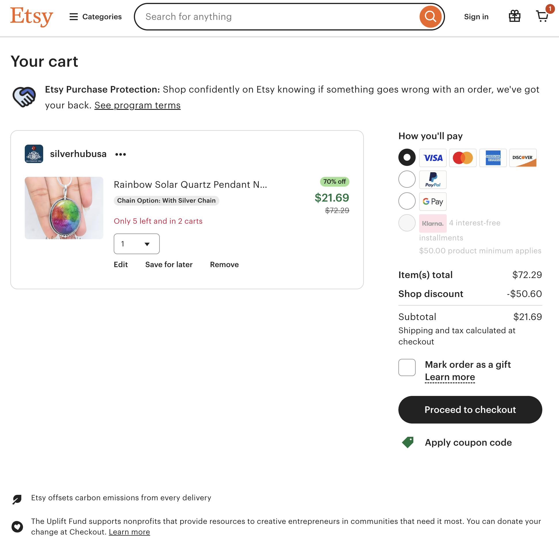 bo
bove:  Final Th
oughts In my discussions with teams, I’ve noticed a common misconception—many believe that express checkout is just a simplified version of the regular checkout process. At a UI/UX level, that might appear true, but in reality, these are two fundamentally different payment experiences designed for distinct user behaviors and intents. Think about drivers approaching a toll booth. Some will instinctively slow down to ensure they see the "Paid" confirmation, while other drivers gliding thru without hesit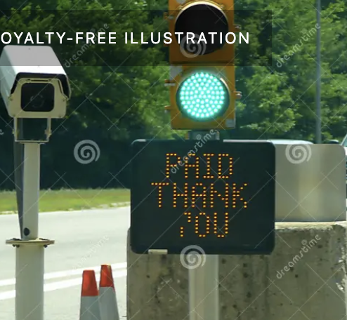 tion.

The same applies to express checkout vs. regular checkout. Express checkout is for users who prioritize speed and trust the system to "just work." Regular checkout, however, still serves an important role—it's there for those who need to double-check details, manually select payment methods, or simply feel reassured by a step-by-step process. It’s about as a “Service Provider”, our UI/UX design or we have solutions are able to accommodate different type of intents/mindsets. For edge cases, backup plans when third-party payment methods fail, or simply for users who need a moment before commi
tion.

The same applies to express checkout vs. regular checkout. Express checkout is for users who prioritize speed and trust the system to "just work." Regular checkout, however, still serves an important role—it's there for those who need to double-check details, manually select payment methods, or simply feel reassured by a step-by-step process. It’s about as a “Service Provider”, our UI/UX design or we have solutions are able to accommodate different type of intents/mindsets. For edge cases, backup plans when third-party payment methods fail, or simply for users who need a moment before committing. It is more than just a fastercli
- ck!
- —
- Human Factors Design Guidance For Driver-Vehicle Interfaces
- Analysis of Driving Behavior at Expressway Toll Plazas using Driving Simulation by Moatz Saad
- Human Factors of Visual and Cognitive Performance in Driving by Candida Castro
- Analysis On the Effect of Express Checkouts in Retail Stores by Jin Kyung Kwak
- The Psychology of Waiting Lines by David H. M