Disclaimer
This blog post is NOT about how to set up. or what success measurement framework used to set up metrics in product development, but a tangible way on quick implementation of metrics, or be specific how to visualize it with underlying data design.
Who is the audience here?
If you’re a product manager, insights person, data scientist, or data visualization engineer, this blog post will show you a framework that covers information design for a metric and code implementation using JavaScript (Highcharts packages) to significantly reduce the effort and time required for building, publishing, and sharing metrics. And make sure you have some working knowledge of Looker.What is a metric?💹
Be specific, what is a “product metric”:A "product metric" is a quantifiable data point that businesses track to measure and evaluate the performance and success of their product
- A quantifiable data point means there is a “big ass number”🔢 at least
- The word track means there is a “temporal” perceptive, i.e. “time~trends”📈
- The word evaluate, success means that a metric should allow us to interpret whether the number is good👍 or bad👎 or call it “Growth” or is your product heading in a direction in favor of your business so that you could “intuitively” make product change.
Inspirations💡
Designing Spicy🌶️ Dashboard
This onboarding training session for insights professionals at Spotify was led by a group of Tableau experts who have dedicated their careers to company key metrics. I’m certain that many companies have a dedicated “key metrics squad” team, equipped to assist their CEOs and management teams as well. What inspired me most from this talk is first time the visualization guru presented a “visual information design” of a metric (although I have been building, seeing, consumed and interacting metric for the entire of my career), but this was first time, someone systematically conducted a “biopsy”🩻 of a metric. You can also find Spotify’s blog post here🔗Information Design of a Metric
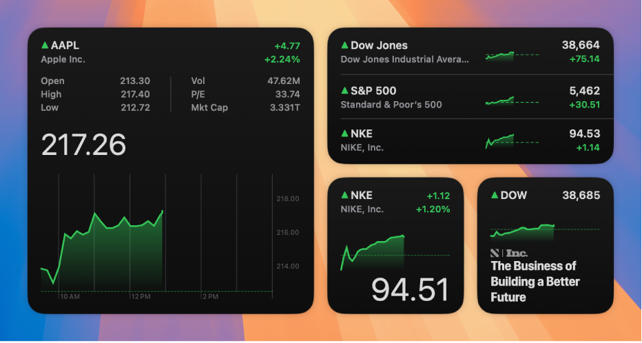
Take a look at this typical Spotify Artists Dashboard, there are basically three groups of data points.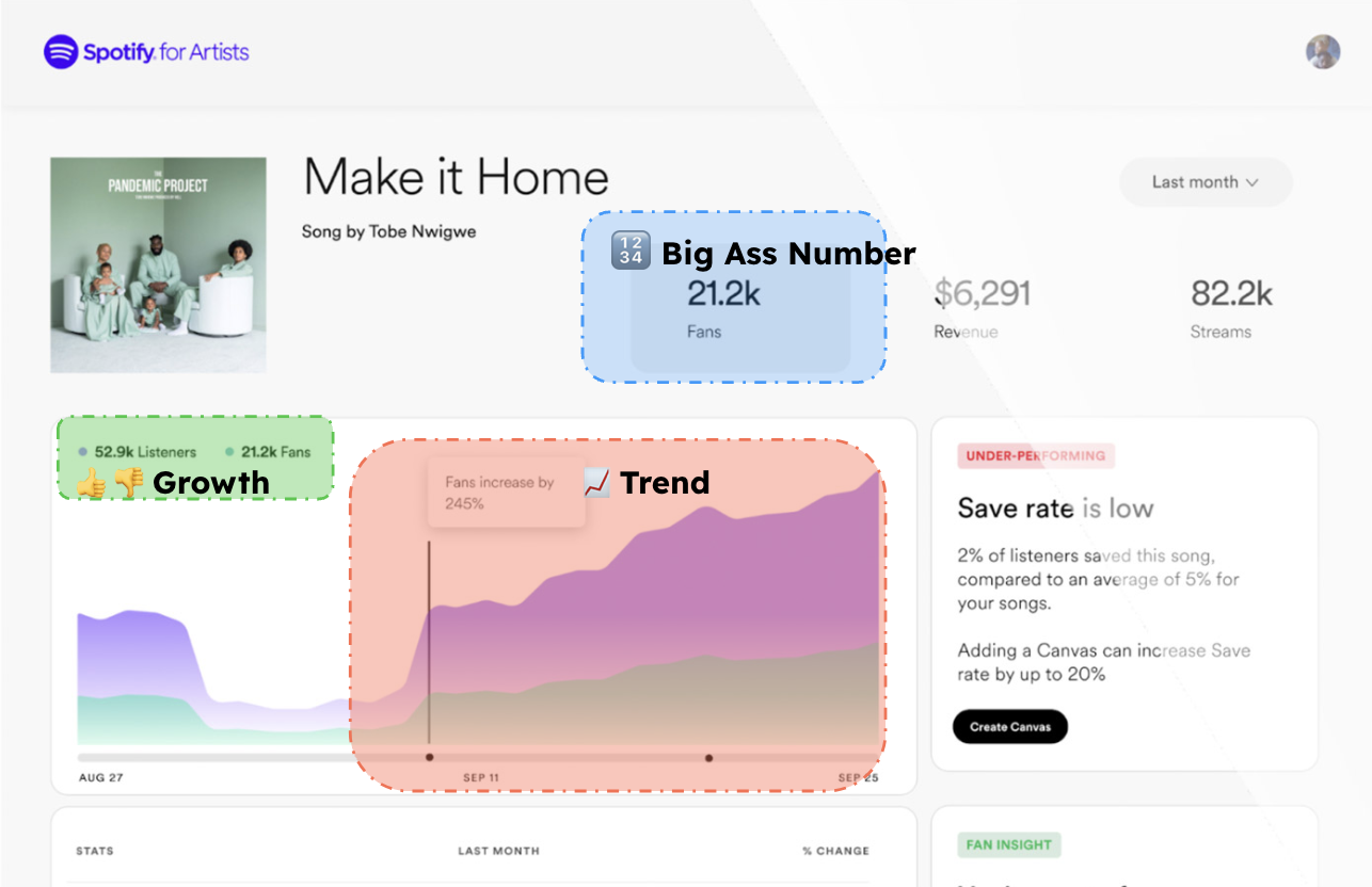 For this particular example:
- 🔢Big Ass Number gives you a quick glance of this song latest stats which has attracted 21.2K fans
- 📈Trend tracks this song’s performance over the time
- 👍👎Growth indicates is it doing good or bad by comparing the past!
Metric as a Widget
In real life, there is another pain point rarely being talking about which resides in the metrics lifecycle. For example, Ubers’s uMetric platform.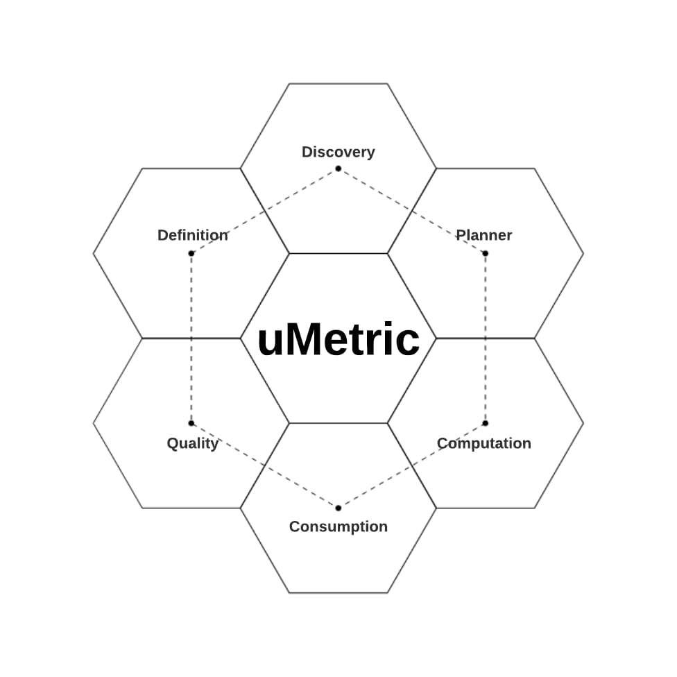 And, for a product manager like me, when people make product decisions, we typically consume a set of metrics in a dashboard to gain insights into the situation and identify areas for improvement. However, this raises the challenge of creating a unique dashboard view for each product feature to facilitate informed product decisions. In big companies like Spotify, Airbnb they all have some concepts called “Metrics Inventory, Metrics catalogue” which usually documenting various metrics sets to measure the performance of different product features.
 However, to quick have metrics built and being available in a dashboard using tools like Tableau, Excel, Spreadsheet, still requires usually analysts or data scientists a significant amount of time and work, many times, even a same metric but in a different dashboard, data person has to rebuild it in those tools (only time saving part is they don’t have to rewrite the underlying sql).
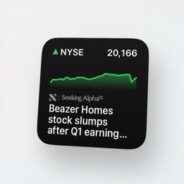
Then, one day, when I updated my iPhone to a certain version of iOS that introduced “Widgets,” I noticed that I could drag these stock tickers onto my screen to monitor my portfolio’s performance. Suddenly, I had a “a ha” moment.
However, to quick have metrics built and being available in a dashboard using tools like Tableau, Excel, Spreadsheet, still requires usually analysts or data scientists a significant amount of time and work, many times, even a same metric but in a different dashboard, data person has to rebuild it in those tools (only time saving part is they don’t have to rewrite the underlying sql).
Then, one day, when I updated my iPhone to a certain version of iOS that introduced “Widgets,” I noticed that I could drag these stock tickers onto my screen to monitor my portfolio’s performance. Suddenly, I had a “a ha” moment.
 And in the meanwhile, Looker (NOT looker studio formerly knows as Google Data Studio) become a new solution we adopted at Spotify (I led team implemented Looker and integrated into our own data platform), unlike Tableau, Looker is a pure browser application relying on “javascript” visualizing “data”.
And Looker comes with a feature called “look”, which is a nickname of a standalone “visualization” in the format of “charts, tables etc” which composed from the underlying data. And you can search, find, customize, reuse and publish them into different dashboard.
And in the meanwhile, Looker (NOT looker studio formerly knows as Google Data Studio) become a new solution we adopted at Spotify (I led team implemented Looker and integrated into our own data platform), unlike Tableau, Looker is a pure browser application relying on “javascript” visualizing “data”.
And Looker comes with a feature called “look”, which is a nickname of a standalone “visualization” in the format of “charts, tables etc” which composed from the underlying data. And you can search, find, customize, reuse and publish them into different dashboard.
So, I was wondering, how to marriage this “look” with the information design mentioned above to address the pain point*Pain point: If the metrics lifecycle is akin to a manufacturing process, reducing the time and effort required to assemble these metrics could lead to the rapid generation of insights. This, in turn, would result in the production of more and quicker products and business decisions.
Implementation
Data Design - Structure
Data Visualization by definition relies on the data design, surprisingly, for a typical metric like we have discussed so far, the underlying data is relative simple, a table of two columns:- One stores the time of the “metric” we look into - a Time Dimension Column
- One stores the value of the “metric” accordingly - a Measure Column
| date | conversion_rate |
| 2021-01-01 | 0.45 |
| 2021-01-02 | 0.56 |
| … | … |
| 2021-01-31 | 0.42 |
- Metric Name from the header of the measure column ~ meta info
- Time Grain from the time dimension column in this example, it is on day level, which let us know we are tracking metric on a day level. ~ you get the 📈Trend info.
- Latest 🔢Big Ass Number, which you can read from the last row of this data structure.
Data Design - Aggregation
If we continue processing this two column data structure, we could get more useful information of the metric, for example:- We can apply different aggregation to the Measure column like: Avg, Min, Max, Median, Sum, in this way, we can get the:
- Average conversion rate, Min or Max of the conversion rate, or if the metric is revenue, by applying the sum, the big ass number we get accordingly is total revenue.
select
date
, avg(conversion_rate) as average_conversion_rate
from this_table
where 1=1
and data >= "2021-01-01"
group by 1
- And since we have time dimension column here, we could apply secondary calculation to the measure column over the time, like we would like the get a moving 7 day average conversion rate so that we eliminate data fluctuations due to anomalies.
- Or simply directly aggregate over time dimension column, aggregate day to week, week to month, month to quarter.
- And lastly, since we have time dimension column here, a simple look up over a 7 day window or 30 day window from the latest metric data, you are able to compute 👍👎growth
select
date
, avg(conversion_rate) OVER (PARTITION BY date ORDER BY date ROWS BETWEEN 6 PRECEDING AND CURRENT ROW) AS conversion_rate_m7d
from this_table
where 1=1
and data >= "2021-01-01"
| date | coversion_rate | conversion_rate_m7d |
| 2021-01-01 | 0.45 | |
| 2021-01-02 | 0.56 | |
| … | … | 0.35 |
| 2021-01-31 | 0.42 | 0.40 |
Data Design - Aggregation from categorical dimensions
Another metric consumption scenario is from categorial data structure. Take the following example which logs the music has been played under different genres. The aggregation still applies for Avg, Min, Max, Median, Sum, by doing so, we are able to compare performance of same metric among different groups (which is also common in product analytics). However, secondary calculations like moving time window is not applying here.| music_genre | plays |
| Hiphop | 1234 |
| Jazz | 2349 |
| … | … |
| Hiphop | 6965 |
Data Visualization from Aggregation
For a typical time series data, a line chart📈 is usually used to visualize the metrics, while a bar chart📊 is usually used for visualize metrics over categorical dimensions. So far, we’ve pretty much covered all the information design aspects of a metric, including the underlying data structure design and the potential direct calculations and secondary calculations that can be performed over a simple two-column data structure. In practical implementation, we write a data translation logic in JavaScript to execute these computations, could be something called: viz_big_number_trend.js or viz_big_number_categorical.jsWhy Highcharts
Looker doesn’t offer a visualization type called “metric widget” out of box, however it supports custom visualization via javascript, with following criteria, we eventually landed on choosing highcharts:- Robust package with rich charting types, good eco system and well support from developer community and documentation
- Native responsive support, remember we will have product manager, stakeholders consume metrics and dashboard via looker in browser, different screens and even on Mobile. The chart should be automatically adapt to different screen size, highcharts is wonderful on this and we barely need do any additional code
- Can be accessed via CDN, which is how Looker works for those custom visuals, just like load javascript like in html tag.
- Minimum development work needed. d3.js is way too complicated in our cases.
DEMO
You can have you looker Admin add the dedicated javascript via Looker Admin portal, it will be loaded as a new visualization type in the charting dropdown menu. ⚠️ Visualization all generated via randomized data or obsoleted data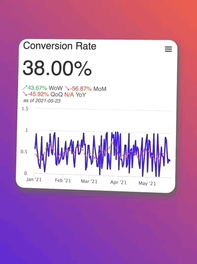
Big number Trend Visualization in Looker
 In our javascript we also provide some additional visual configuration Looker supports, like convert the big ass number into different human readable format along with secondary calculation visualization toggle like choose different lookup windows.
Big number over categorical dimension Visualization in Looker
Dashboard assembled from metrics
 Sample Code: klynwuu/looker-metric-as-a-widget🔗
LICENSE: CC BY-SA 4.0🔗
Sample Code: klynwuu/looker-metric-as-a-widget🔗
LICENSE: CC BY-SA 4.0🔗